How to use fine art skills in digital design
5 visual art skills that translate to web design.
In an over-saturated and under-paid market, many fine and visual artists are turning to adjacent industries, such as digital and web design, to make their career. Individuals may be tempted by well-paying, stable jobs in an otherwise uncertain market, or perhaps simply by the desire to be a part of the changing ways in which people live and experience their lives.
Many of those looking to jump ship into the world of tech are those who have studied or practiced fine arts. I, myself, fall into this group. This article aims to lower the drawbridge between the fine art fortress and the wild world of tech.
If you are a fine artist curious about how your skills and knowledge can translate into a career designing websites, applications, and other digital products and spaces, keep reading.
Art School, In Short
After high school I wasn’t sure what to do with my life, but I was good at painting so I decided to go to art school. My life turned into a whirlwind of long days in the studio and long nights spent drinking cheap beer and shooting pool in the grungiest bars in the city. I was a walking stereotype with overgrown eyebrows and paint-covered jeans.
After 4 years, I had earned my degree in critical and curatorial practices with a focus in painting. While I found my work to be deeply satisfying on a personal level, I just couldn’t see myself working in a museum or taking on the life of a struggling artist — I wanted to have a broader impact on peoples’ lives and, if I’m being totally honest, I was tired of having to side-hustle.
Bootcamp and Beyond
After floating in visual merchandising and digital marketing for a few years, I got a job at a scrappy tech startup which opened my eyes to the world of tech. I was working in marketing and research, but I found myself longing for the creativity and visual problem-solving of my past life. At some point during my meandering foray into tech I discovered UX design, which seemed like the perfect marriage of my creative and analytical skills, so I gave it a shot.
Like any good tech-kid, I took a 6 month bootcamp so that I could jump ship and kick-start my UX career. I was expecting to be thrown into an entirely new educational environment, of which I knew little about, but I actually found that many of the research and visual communication skills I had learned in art school could be translated to a digital medium. I have since been working in UX research and design and have found that this overlap holds up across a variety of spaces.
“The art challenges the technology, and the technology inspires the art.” — John Lasseter, American Animator
The Difference Between Fine Art and Digital Design
Collaboration
One of the greatest differences in moving from paint to pixels is the need for a collaborative approach. I’m no longer creating art with my own agenda, but in partnership with other teams and leaders to achieve a common goal. What’s more, as a UX Researcher, I study the needs, feelings, and movements of the users interacting with my designs, and I often feel as though I’m collaborating with the user to produce something that has a very real impact on their lives.
Fine art can be collaborative, but UX/UI design must be collaborative.
Impact
One of the most rewarding aspects of a career in digital design is the potential impact your work can have on the lives of your users. Technology has dug deep roots into every area of our lives and it’s a profound responsibility to produce something that will enter into the homes, offices, schools, and public spaces our users occupy. We are designing tools that help users shape their mood (and their mind), connect with their community, and interact with the world around them.
Good art impacts a person’s life, but good design becomes a person’s life.
Fine Art Skills That Translate to Digital Design
When I began learning and experimenting with user interface design, I found that many skills from my fine art education simply did not translate, but there were a number of key principles that did. The following is an (incomplete) list of major areas of overlap that I’ve found between visual art and digital design strategies.
Focal Point
What’s the same:
Controlling the eye of the viewer is vital in creating the experience and evoking the meaning you’re intending with your work. The same is true of digital design. In a painting or drawing you might use contrasting colors, size, and object positioning to bring attention to one (or a number of) key focal points.
These same tools can be used when drawing attention to a button you want them to click, or when guiding a user through an onboarding flow, for example.
As in fine art pieces, it is wise to focus on one element, and you typically don’t want to focus on more than three, as this dilutes the focus and may become confusing for the user.
What’s different:
While many of the same principles apply, web design has a number of important differences. You now have some new and exciting tools in your creative toolbox such as motion and micro-interactions which can help reinforce the focus based on how the user is interacting with your design.
It’s also important to note that users have a lightening-fast attention span when on a webpage. Art demands attention, and individuals might stop to savor your work and understand its meaning, but a web user is not typically going to interact with your work in the same way.
You must be ruthless in prioritizing elements and cutting the fat if you want your work to be successful, particularly on small screens.

Color
What’s the same:
In both fine arts and digital design color can be used to convey information or evoke many types of emotional and psychological responses. Color theory is very important in digital design and you see many classic color schemes (monochrome, complimentary, triad, etc) being used across the industry.
Color is one of the most important tools to an artist or designer. The deliberate placement (or removal) of color can effectively create mood, meaning, focus, and subtext in a work.
What’s different:
As in all areas of art and design, there are trends that come and go. Flat design and bold, bright colors are very in-Vogue in digital design right now — Joan Miro probably would have been a fantastic web designer. Contemporary web design also tends to lean on negative space to declutter the page and highlight a few important elements.
As in fine art, there are visual trends in digital design as well. The choice to follow trends or go against the grain is that of the artist.

Light & Shadow
What’s the same:
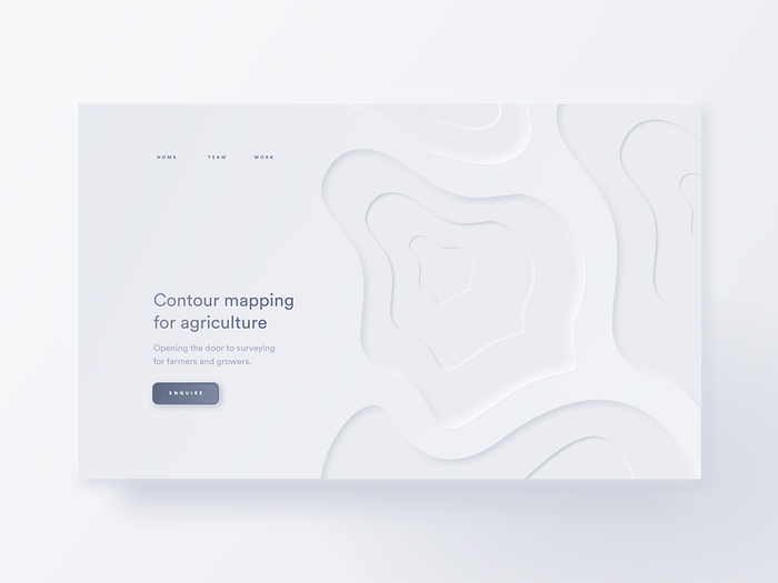
Speaking of digital trends, the use of light and shadow has come and gone over the years. Recently, a design trend called neumorphism hit the design scene hard. In short, “neumorphism” is “new skeuomorphism” (see example below). This design trend, though highly polarizing in the design community, is a fantastic example of how light and shadow is being used in digital design.
Fine artists understand the power of light and shadow in conveying space, form, and relative position in a work. While not always in-line with digital design trends, it has serious potential when used tastefully.
What’s different:
Light and shadow in digital design might be somewhat inconsistent. For instance, if shadow is being used on a primary button to add emphasis (see below), the corresponding highlight might be missing or you might not see the same shadow on other buttons present.
While the designer sometimes aims to create a fully 3-dimensional space through light and shadow, it is often used merely as a tool for emphasis.
Depth
What’s the same:
Depth is light and shadow’s big sister and she wields a powerful sword. Many websites are adding 3D objects and animations to their otherwise flat sites. This can add personality and intrigue and many designers are using this to their advantage.
Many websites have preserved a mostly flat aesthetic, but have added color and flare through floating objects or scenes within that space.

What’s different:
Many sites (see Facebook) have opted to use “flat design” for its bold/ accessible colors, simple navigation, and easy to read the text, making it a highly effective and user-friendly mode of design. The downside of flat design is the relative limitation in the designer’s toolbox and brand personality.
While it’s not impossible to create a fun and interesting website using flat design, the focus tends to be on the content of the website rather than the design itself. Some designers have chosen to re-incorporate illustrations and 3D objects into the design to capture the attention of users who have grown used to flat design. Parallax imagery and illustration are also very fun ways in which the depth and movement of the design changes based on the user’s movement.
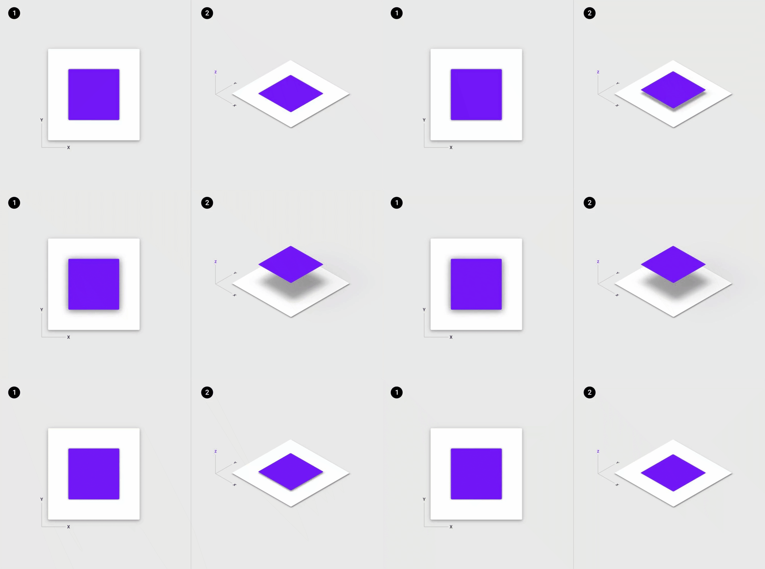
Google has also created Material Design, which outlines how they use shadow and depth to create a very effective aesthetic that captures the benefits of flat design while adding a pop of personality.

Critique
What’s the same:
As an artist or designer, it’s important not to work in isolation. While many people lock themselves away for a period of time to focus and produce work, eventually they have to come out and show that work. Seeing how individuals react to, and interact with, your work is essential in knowing if your intended impact was made.
In short: all art needs data.
What’s different:
The biggest difference, is the ability to see your work in action and amend your designs based on what you learn — the process becomes bi-directional. User research and testing are a vital part of effective web design and allow you to ensure your work has the intended effect for the user.
Digital design is empowered with traffic analytic tools such as GoogleAnalytics or more in-depth interaction information can be collected with moderated user testing sessions or passively with tools such as UserTesting and Hotjar.
The best part is the sheer speed and volume with which you can collect data and iterate on design. You can publish your design, see how users interact, and change elements before the paint is dry — in fact nothing need-be final because the paint is never dry in digital design.
In a sense, digital design becomes a collaboration between the designer and the user, as each always affects the other.
Final Thought
If you take away only one thing from this article I hope it’s this: art is not made through any one medium, it is made through the artist. As an artist, you are a problem solver and a communicator, and whether you’re working in paint or in pixels, you have the potential to change lives. I will leave you with Daniel Bell, the American sociologist who said,
“Art and technology are not separate realms walled off from each other. Art employs techne, but for its own ends. Techne, too, is a form of art that bridges culture and social structure, and in the process reshapes both.”


